Zipwhip
Account Console
Project Type: Team, In-house at Zipwhip
My Role: UX Design and Usability Testing
Skills: Prototyping, Usability Testing
Tools: UXPin
OVERVIEW
Zipwhip is a B2C messaging platform that allows businesses to send/receive SMS text using their landline numbers. The company was going through a significant growth in 2016, and needed to redesign its web app in order to meet the customer needs that were growing even faster.
Problem
The current Zipwhip web app is mostly being used by SMB’s and lacks the advanced account management tools that enterprise customers demanded. Also, the current billing system requires a manual verification process, which creates a bottleneck and affects scalability.
Solution
Our team of 3 designers built an interactive prototype of the new Account Console with:
administrative tools for advanced user/line management
integrated billing system for purchasing plans and user licenses
"...customer needs that were growing even faster."
1. Discovery Phase
When I was brought onto the design team, the product team had already done the initial groundwork to identify the target user base and created personas from the following data:
55% multi-user single-line operator (e.g., insurance agent)
35% multi-user multi-line admin (e.g., dealership general manager)
5% multi-user multi-line operator (e.g, customer service reps)
5% other
Personas developed during Discovery Phase
"...to see if we were headed in the right direction"
Before diving deep into the design phase, we wanted to talk to users to see if we were headed in the right direction. We conducted 8 usability testing sessions and aggregated the findings.
Screenshot of Bradley (left) facilitating an in-person, moderated usability test session with Tom (right).
Some common patterns emerged, and we learned that:
Users mostly understood what the Account Console was for
They appreciated that the zipwhip web app will now have a dedicated admin dashboard
Managing an account involved some pretty complex concepts and scenarios
For example, they had trouble understanding the relationship between Users and Lines
Some had difficulty locating certain settings and features within the prototype
"Managing an account involved some pretty complex concepts and scenarios"
2. Design Phase
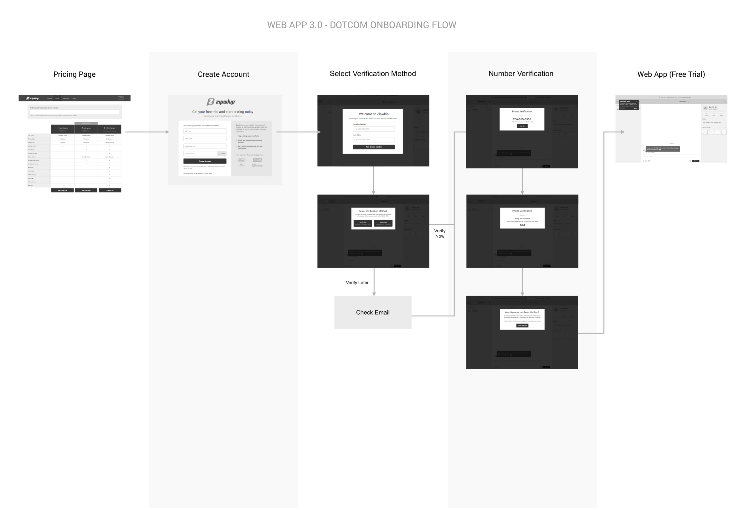
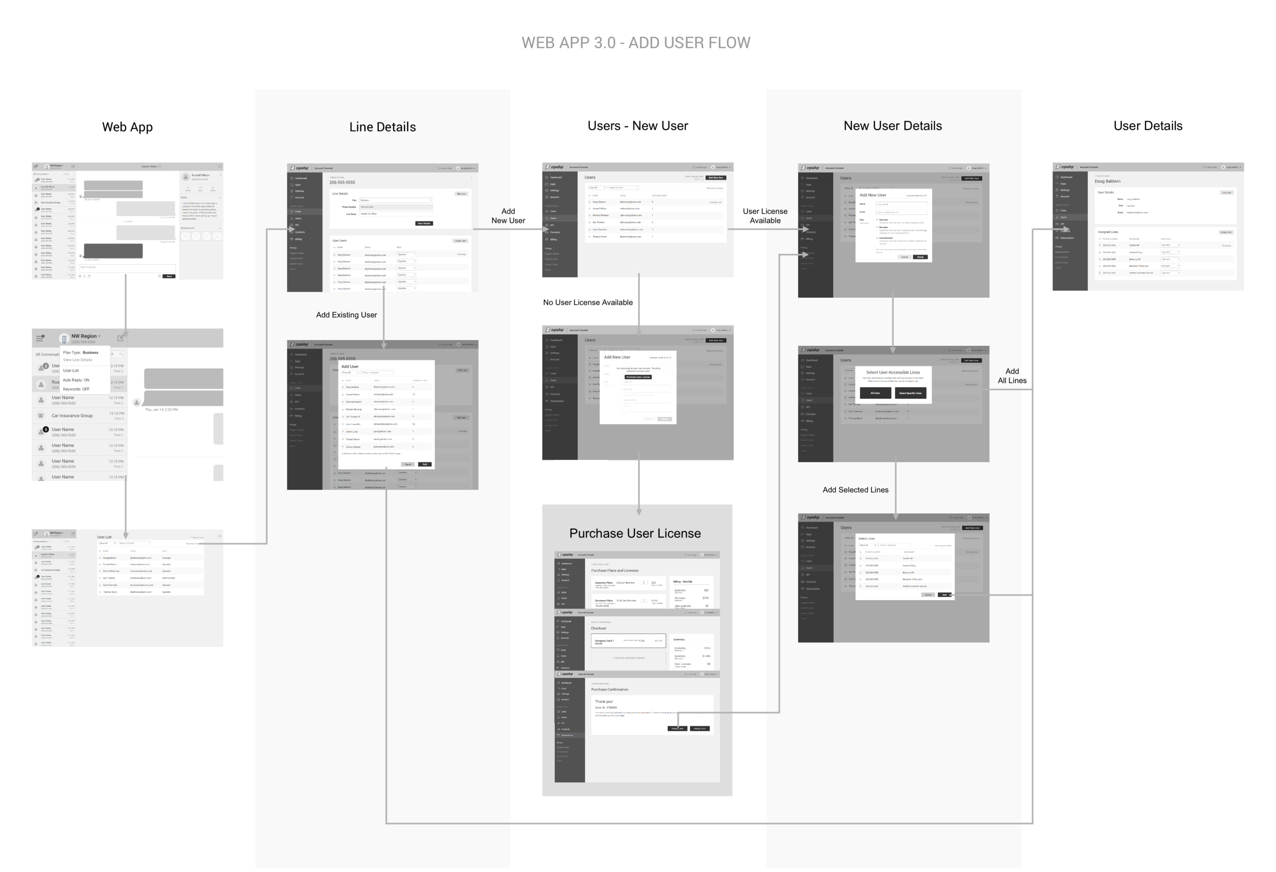
We already knew from the get-go what “features” we needed to build: advanced admin tools and an integrated billing system. However, rather than designing them as individual features or requirements, we zoomed out a little bit and approached them as a set of user flows.
This perspective helped us see the relationship between those features, which in turn helped us focus on how to make it easier for the users to understand and use them. We identified the following core user flows and designed the relevant parts of the prototype.
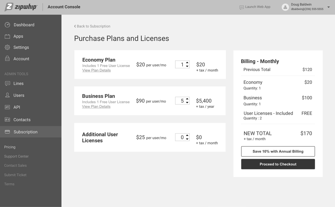
The Subscription page was designed to kill five birds with one stone:
Clearly shows the relationship b/w Lines and Users
Conveys that User Licenses are sold separately
Illustrates Zipwhip's pricing structure
Gives you the option for monthly / yearly billing
Checkout flow can also be used for trial users converting to paid
"designed to kill five five birds with one stone"
3. Outcome
We built the new Account Console prototype that shows our vision for the new Zipwhip platform. But we wanted to roll out some of the new features to the current Zipwhip web app before the all-new platform was ready to be launched. So we built this hi-fidelity prototype with account management and reporting feature (this was one of the most frequently requested messaging features that would definitely appeal to enterprise customers).
Account - Billing Info Page
Reporting - All Messages Page


