Zipwhip
Website Redesign
Project Type: Team, In-house at Zipwhip
My Role: UX Design, Content Strategy
Skills: Wireframing, Prototyping
Tools: UXPin
OVERVIEW
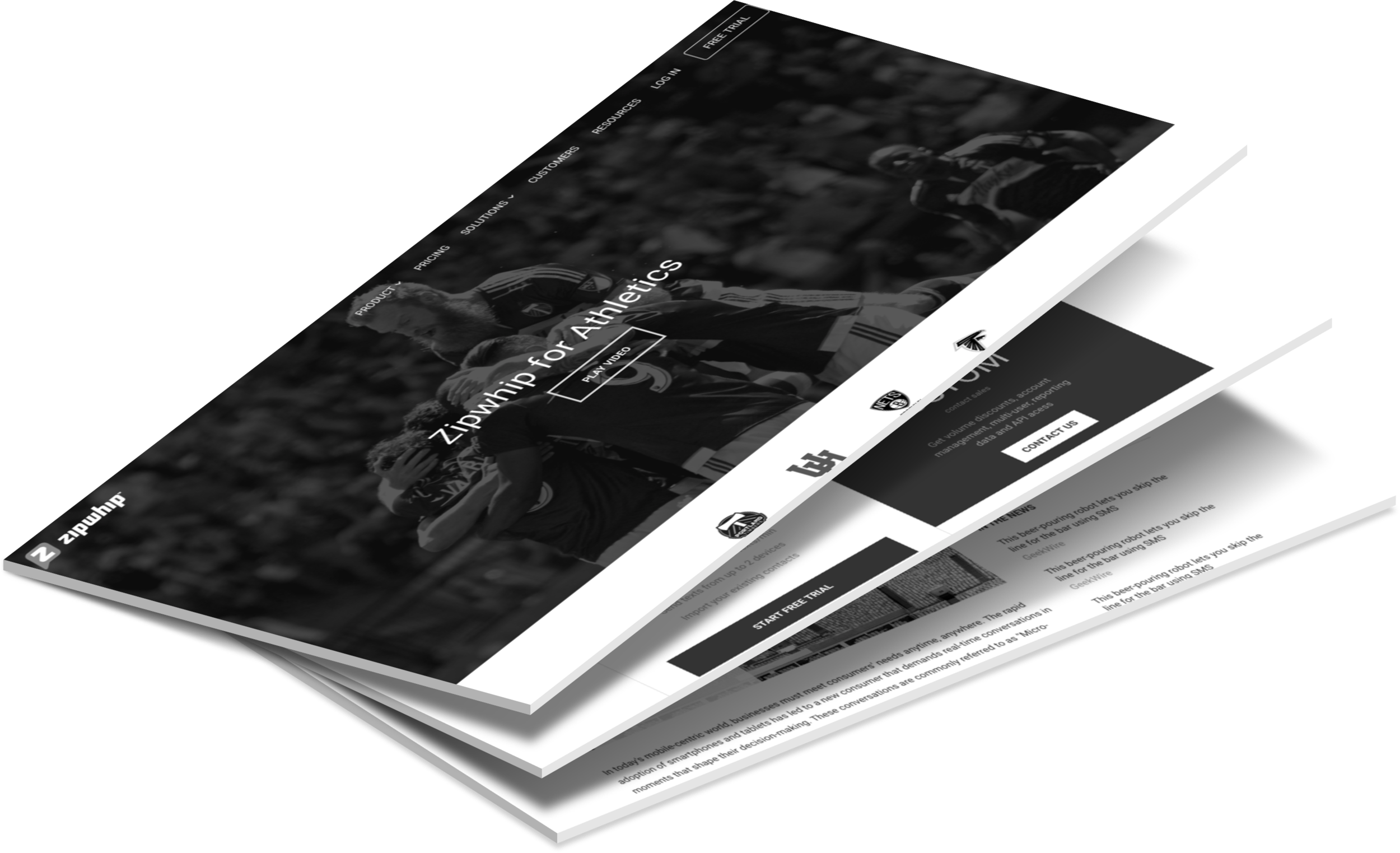
Zipwhip's current website primarily focuses on SMBs, and has a startup-like look and feel. But the company—and its product—has matured over the years, and its website needed to reflect the best of class company that is Zipwhip.
Problem
Our challenge in this project was two-fold: to redefine the visual elements and to reorganize the structural elements of the website. Our primary goals were to better serve the needs of our growing user base and to better present the company as an established SaaS company.
Solution
Our team of 3 designers prototyped an initial version of the new Dotcom that highlights:
updated navigation
streamlined flow for main CTA
redesigned pages for Pricing, Customers and Resources
"...to reflect the best of class company that is Zipwhip."
1. Discovery Phase
First, our design team sat down with Product and Marketing to discuss what pages and content needed to be in the new website. We learned that Enterprise customers were becoming increasingly important to our business, and that the Sales team was targeting 6 core industries or "verticals". So our new Information Architecture would feature the following:
restructure Customers tab around "verticals"
add Solutions tab for Enterprises
add Resources section
Information Architecture - CURRENT SITE
Information Architecture - NEW SITE
"...a critical problem in the main call-to-action flow"
We also identified a critical problem in the main call-to-action flow: there were two main CTA buttons on the homepage that each lead to a different page. It was confusing to say the least, and possibly costing us quite a few customers down the trial-user funnel.
The solution to this problem required 3 parts:
fix the user flow
design a new pricing page
support from the web-app side
CTA Flow - Current Site
CTA Flow - NEW SITE
This problem existed partly due to the fact that creating a Zipwhip account with a text-enabled number required a manual activation process done by an Account Executive from the Sales team. To automate this process, we were already building the all-new Account Console. So we need to make sure that the customer-facing homepage supported this with a streamlined CTA flow and a new Pricing page.
"...a streamlined CTA flow and a new Pricing page."
2. Design Phase
In designing the new Pricing page, I learned that the traditional 3-column matrix would not be suitable for Zipwhip. Its pricing structure could get pretty complex once you start adding multiple lines or buying more user licenses.
So our design team discussed with the product managers and agreed on a design that may be non-traditional but unique and effective. It focuses on getting the user to start texting (via Trial) at the lowest price available. Enterprise customers can contact Sales for help. Once you start a trial, you can test drive the product and purchase a plan through the all-new Account Console.
New Pricing Page with Two Cards
"Start Texting. Pick a Plan Later"
I also designed a new Resources page that would address the following needs:
have a central place for articles, white papers, and videos
help expose all the awesome content generated by Marketing
attract visitors to the page and generate new leads for Sales
Resources - Index View
Resources - Content View
3. Outcome
As we finished building the first prototype of the new Dotcom, we felt confident that we have:
set the right tone and vision for the company's new website
defined a strong CTA flow that leads to more trial users
designed effective pages for Pricing, Customers and Resources
Check out these pages that I created and let me know how you like them!


View live on www.zipwhip.com/resource-center/